
At this present time, people transfer many valuable data through the internet. The collected data in one place pull out helpful information to support various kinds of business. The raw data and specific information generally distribute in the firm to communicate with all levels. Sometimes it is pretty hard to describe the mathematic data to people who have no potential information in advance. So the data analysts have a duty to present the data in an effective way to let their co-workers understand in the same direction. In the past, we might adapt some office applications that we have to create visual graphs, and draw pictures such as Microsoft Office (Powerpoint, Excel, Word), Adobe Products (Photoshop, PDF), etc. Nowadays people change lifestyles to work from home and run their businesses during the trip. It is time to update our work into the online tool platform that may give us a free trial or pay to upgrade for a professional job. Last few months, I had a chance to study on Tableau which is one of the popular tools to create data visualization without complicated commands to handle. Let’s see how it works!
Tableau is a user-friendly interface tool for the non-programing user.
I select Online Shoppers Intention UCI Machine Learning to demonstrate in my study case. The dataset was collected in the excel sheet which I separated into several worksheets as user data, and web traffic data. We can change our data file as much as we want for example You can put some calculations in any field or use the filter option in excel, even create the formula to categorize the data before figuring out the chart.
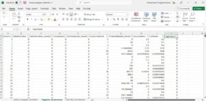
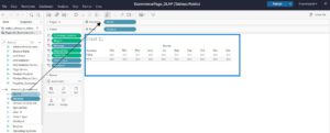
Edited online shopper intention dataset in excel
We will sign in to Tableau online to create the dashboard from our dataset. It also has an offline version to create the task and then public to the online site. Here I am creating a Viz on Tableau site which I already make the registration for my own space as shown below.
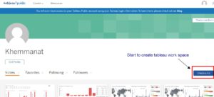
Create a viz on your tableau account
We are going to import the cleaning file into Tableau workspace. You will have to link the worksheet which requires setting the relationship between worksheets as similar to the primary key setting in the relational database table. So it can show accurate information automatically whatever chart is presented on the dashboard.
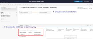
Import the excel file to Tableau workspace
In practice, the three information charts likely have the duplicated method. When you understand the way to create the first chart, it leads you to other models that can apply infinite data design. There are 4 identical areas that we will manipulate to generate the chart for our presentation.
A. All the fields in the imported excel files will show in the panel which you can select or drag to other areas in order to filter/marks/measure data into a row or column on the chart.
B. This is a part to filter or highlight the specific information(color, shape, size, and detail) that you need to present on the chart
C. Identify the data into row and column(x or y dimensions)
D. Choose the visual chart/diagram that matches the selected data.
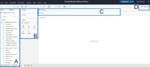
A Tableau worksheet to create a chart for presentation
You can drag any field to a panel of row and column to show the actual data. Tableau will show the result on the main page(blue square area). Then you decide which chart should be compatible with your data. In this case, I select the revenue and month to show on the screen.
Select row and column data to present in the work area
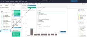
To count the total revenue on each page, I click on the revenue field at the row pane and select the measure with the count function.
Add the measure on the field row
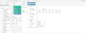
The first default chart will automatically generate into the main area. However, you can change to other diagrams that this tool supports this data. See on the right side, you may update it to a pie chart, line chart, etc.
Generate the default chart that matches the data
You can separate the revenue TRUE or FALSE by masking the color. Go to drag the revenue field to the mask color area. You will see the result on the chart.
Mask the bar chart color to separate the field values
You can specify the filter in this revenue by adding the filter. Click on the field type that you want to add the filter then press edit filter. In this case, I will add the traffic filter which ranges from 1-10.
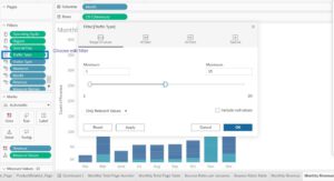
Edit filter on the traffic field that makes revenue
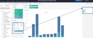
You can use the measure value field in the left panel to place it in a row or column. Click on the measure value field to choose the summarized data that you want to show on the chart. It will set the sum or count formula as default.
Measure data value by default field setting
There are three pieces of information that would like to present on the dashboard. I will separate three worksheets for each data type.
- Monthly Total Page Number
- Monthly Revenue
- Bounce Rates per session
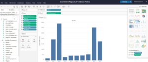
Example of Monthly Total Page Number worksheet. I have already updated all the areas to create my first chart. I select the bar chart to present the information Number of page sessions per month. I use the bar color to filter the page titles. Finally, summarize the data in the measure box on each page title: administrative page, information page, and product related page.
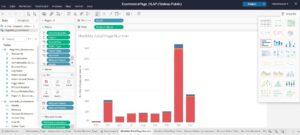
Prepare the Monthly Total Page Number worksheet to put into the Dashboard
In my dashboard, I also create a data table that set the interaction with the bar chart.
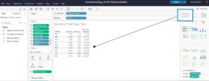
Interactive table with the bar chart
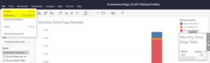
After we create all the components in our dashboard, we will put them together in Tableau dashboard sheet. Click on the Dashboard icon, you will get the new page that provides a box sheet. Then, you choose the sheets that you want to add to your dashboard and arrange them to be easy for navigating to the related charts.
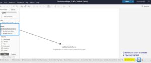
Create a new dashboard sheet in Tableau
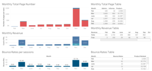
All the component charts are arranged into a dashboard
To make every table and chart interactive with each other, we will have to click on the filter icon of every element that shows “Use as a filter” to be active. Tableau can automatically set the relation of every data sheet if you select the filter icon over them.
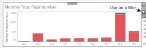
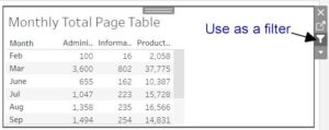
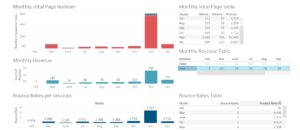
Tableau dashboard click to show revenue in TRUE
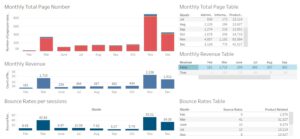
Tableau dashboard click to show revenue in FLASE
You can share this dashboard with your coworker by public it and getting the share link to access it through the online website.
Create a link to access Tableau online
Here is a sample ecommerce dashboard that is published in my tableau online account.
I hope that you enjoy my sample test dashboard by Tableau!
Thank you
This blog is a part of my business intelligence course at Assumption University
Thank you to my advisor Dr. Kanoksak Wattanachote